Dynamic Sign System
About the project
Date:
Jun 24, 2025

Project Details
Problem:
Despite decades of established Human-Computer Interaction (HCI) principles emphasizing clear feedback (Nielsen's heuristics, Shneiderman's rules), static interfaces fail to provide timely, context-specific guidance precisely when a novice user needs it most, leading to high friction and drop-off.
The Core Challenges:
User Hesitancy & Drop-off: Research showed that over 79% of novice users, when confused by a new app, turn to external sources (Google, YouTube) rather than relying on the interface itself.
Static Limitations: Traditional signifiers, while consistent, are either permanently visible (causing clutter) or hidden (requiring the user to actively seek help).
Design Gap: While dynamic cues exist in sophisticated apps (e.g., Grammarly, Figma), there is no formal HCI framework or nomenclature (e.g., "Dynamic Sign System") for systematically designing and implementing them without creating distraction or cognitive overload.
The primary research challenge was to prove that a dynamic sign system could meet the user demand for "help at the right moment" without violating the principles of clarity and consistency.
Solution I Came Up With in Detail:
The solution involved a Practice-as-Research (PaR) methodology, translating established HCI theory (Norman, Nielsen) into tangible, evaluated design patterns within the CoWork prototype.
1. Context-Aware Triggers and Micro-Interactions
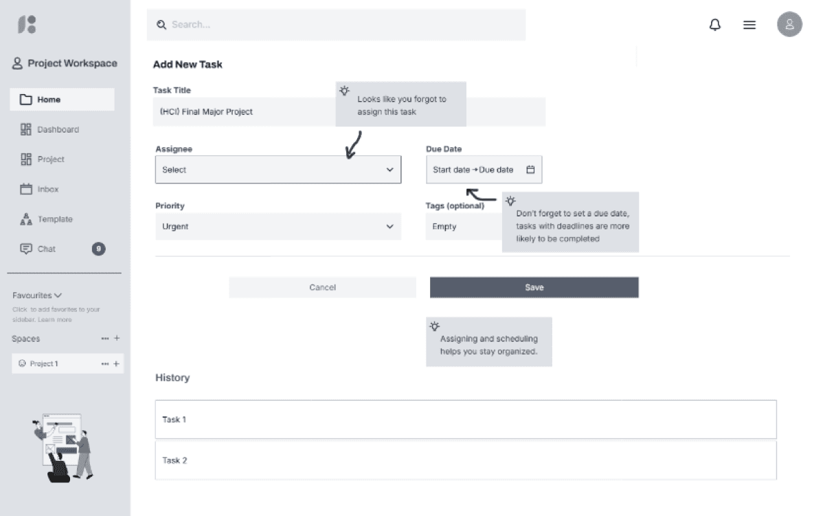
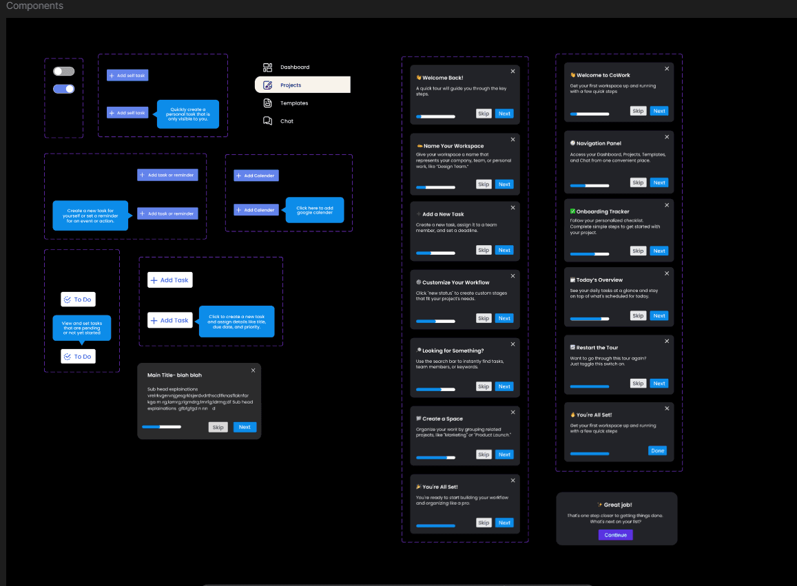
The Dynamic CoWork prototype was built with specific trigger states designed to detect user intent or confusion.
Trigger Condition | Dynamic Signifier Action | Goal |
|---|---|---|
Empty State (Dashboard has no tasks) | Flashes the "Add Task" button softly, and displays a contextual hint: "Start your first project here!" | Orientation & Initiative: Guiding the user's next best action. |
User Hesitancy (Cursor hovers over a field for > 5 seconds) | Displays a concise, contextual tooltip: "Due dates boost completion rates by 80%." | Confidence & Justification: Providing help at the point of need to reduce guessing. |
Skipped Required Field (User tries to submit without a Due Date) | Flashes the skipped field and displays a personalized error message: "Looks like you neglected to assign a date." | Error Prevention: Framing the system as helpful, not corrective, to reduce frustration. |
2. Systematic Implementation (Addressing Cognitive Load)
To prevent the adaptive cues from becoming distracting, a principle of Progressive Disclosure based on Context was strictly followed:
Cues Only Appear When Relevant: Unlike static tooltips, dynamic cues were "offline" until a specific behavioral or contextual condition was met, ensuring minimal visual noise.
Gentle Visual Hierarchy: Cues used soft flashing or subtle emphasis overlays instead of jarring modal pop-ups, allowing users to reorient themselves at their own pace. A Restart Toggle was also included to allow users to reset the guidance.
3. Comparative Evaluation
The project’s strength lay in its methodology: participants completed identical tasks on both the static and dynamic versions.
Metric: Task completion time, error rates, and subjective user confidence (measured via post-task questionnaires).
Result: The dynamic prototype was consistently rated higher in terms of perceived usability and clarity. Users reported feeling "more supported" and completed tasks with fewer errors compared to the static version.
This systematic approach formalized adaptive signifiers into a tangible design pattern, successfully answering how to integrate these cues effectively without causing overload.